


S1 · Episode 3
Your MFA Is Annoying for a Reason
with Sample Guest
SAMPLE EPISODE. Why multi-factor authentication feels like friction, why that friction is the point, and how to roll it out without a staff revolt.
Version 1.0 — November 2026
How to use the Refreshingly Human IT name, logo, colors, type and voice.
Refreshingly Human IT is a podcast from Tech Dynamix about technology as it is actually lived: by people, in real businesses, with real constraints. We talk about IT without the jargon, the fear-selling, or the vendor gloss.
| Show name | Refreshingly Human IT |
| Endorsement | A Tech Dynamix Podcast |
| Tagline | IT conversations, minus the jargon. |
| Promise | Smart, honest tech talk you can use on Monday. |
| Audience | Business owners, operations leaders and IT generalists who want straight answers. |
| Personality | Warm · plainspoken · curious · quietly expert · a little bit funny |
We sound like the smartest person in the room who also happens to be the friendliest. We explain, we don’t lecture.
✓ Do
✕ Don't
Episode titles are short, specific and conversational: “Your MFA Is Annoying for a Reason” beats “Multi-Factor Authentication Best Practices, Part 2.”
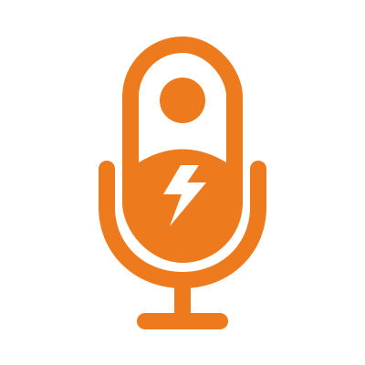
The logo combines a microphone (the conversation), a person (the human) and a lightning bolt (energy and technology), with the wordmark underlined by our signature double swoosh.


| Background | Use | File suffix |
|---|---|---|
| White, Paper or light photos | Ink type + orange symbol | -light- |
| Ink, charcoal or dark photos | White type + orange symbol | -dark- |
| One-color print, engraving, fax | Solid ink | -black- |
| Single-color on dark or on orange | Solid white | -white- |
Prefer the SVG files for screen and print. Use PNG only where SVG isn’t accepted.
Our palette is deliberately small: one confident orange, a near-black ink, and warm neutrals that keep things human rather than clinical.
#ED7A1C RGB 237 122 28The brand color. Symbol, swooshes, highlights, primary buttons.
#111111 RGB 17 17 17Type on light, dark backgrounds, header and footer.
#FFFFFF RGB 255 255 255Type on dark, cards on Paper.
#A84F0A RGB 168 79 10Orange for text and links on light backgrounds (passes WCAG AA).
#FAF6F0 RGB 250 246 240Default page background. Warmer than pure white.
#1C1A17 RGB 28 26 23Body text, raised surfaces on Ink.
#5A544C RGB 90 84 76Secondary text, metadata, captions on light.
#B8B2A8 RGB 184 178 168Secondary text on dark.
#E7E0D5 RGB 231 224 213Borders, dividers, subtle fills.
Roughly 60% neutrals (Paper/White), 30% Ink, 10% Signal Orange. Orange is the spark, not the wallpaper. The one exception is a full-bleed orange call-to-action band, used no more than once per page.
| Foreground | Background | Contrast | OK for |
|---|---|---|---|
| Ink | Signal Orange | 6.7 : 1 | Buttons, labels, all text |
| Signal Orange | Ink | 6.7 : 1 | All text, links, highlights on dark |
| Ember | Paper | 5.2 : 1 | Links and orange text on light |
| Stone | Paper | 7.0 : 1 | Secondary text |
| Ash | Ink | 9.0 : 1 | Secondary text on dark |
| White | Signal Orange | 2.8 : 1 | Never for text. Use Ink on orange. |
| Signal Orange | White / Paper | 2.8 : 1 | Never for text. Decorative only, or use Ember. |
The wordmark is set in a bold neo-grotesque. On the web we echo that with two free, open-source Google Fonts.
Display · Archivo 800
Tech talk for humans.
Body · Inter 400
We sit down with the people who keep businesses running and ask the questions you'd ask if you weren't worried about sounding silly. No jargon, no fear-selling, just useful conversations.
| Role | Font | Weight | Size (desktop / mobile) | Notes |
|---|---|---|---|---|
| Display / H1 | Archivo | 800 | 64 / 40 px | Tight tracking (-0.02em), line-height 1.05 |
| H2 | Archivo | 800 | 40 / 30 px | |
| H3 | Archivo | 700 | 24 / 21 px | |
| Eyebrow / label | Archivo | 700 | 13 px | ALL CAPS, +0.12em tracking, mirrors the endorsement |
| Body | Inter | 400 | 18 / 17 px | Line-height 1.65, max 68 characters per line |
| Small / meta | Inter | 500 | 14 px | Stone on light, Ash on dark |
Fallbacks: Arial, Helvetica, sans-serif. In Office documents, use Arial Bold for headings and Arial for body.
Lifted straight from the wordmark. Use it to underline one key phrase per headline, like minus the jargon . Never more than one per screen, and never under body text.
Use the master artwork, rhit-double-underline.svg: two hand-drawn strokes in #E87722, a heavier top stroke and a lighter, shorter one below at 72% opacity. Stretch it to the width of the phrase; don’t redraw it, recolor it or replace it with a straight line.
The lightning bolt from the icon marks energy and “aha” moments: list bullets, key takeaways, the “now playing” state. Always Signal Orange or white, never on its own as a logo replacement.
These live examples come straight from the website theme, so the guide and the site can’t drift apart.
Episode card
S1 · Episode 3
with Sample Guest
SAMPLE EPISODE. Why multi-factor authentication feels like friction, why that friction is the point, and how to roll it out without a staff revolt.
Text link and tags
All artwork is in the logo kit at refreshingly-human-it-logo-kit/ and published on this site under /brand/.
| File pattern | What it is |
|---|---|
rhit-horizontal-endorsed-{light,dark,black,white}-transparent.svg | Primary lockup |
rhit-stacked-endorsed-… | Stacked lockup with endorsement |
rhit-horizontal-clean-… / rhit-stacked-clean-… | Lockups without endorsement |
rhit-icon-… | Microphone icon only |
…-solid | Same artwork on a supplied white or ink background |
png/… | 3200 px wide raster versions (icon 2048 px square) |
The Signal Orange value (#ED7A1C) is a refined approximation from the concept artwork. Confirm it with Tech Dynamix before commissioning print or merchandise, where a Pantone match should be specified.